
Stories
McLaren Unveils New Logo Inspired by Founder Bruce McLaren's New Zealand Workshop
C
CNBC TV18•23-09-2026, 11:13
McLaren Unveils New Logo Inspired by Founder Bruce McLaren's New Zealand Workshop
- •McLaren has redesigned its logo and visual branding, merging its Automotive and Racing identities for the first time, signaling a longer-term repositioning.
- •The new wordmark is based on signage from a service station owned by Bruce McLaren's parents in Remuera, Auckland, where he built his first race-winning car.
- •Chief creative officer David Woodhouse emphasized the redesign reconnects the brand with its founder, moving beyond a period of not recognizing his legacy, while asserting it's about "future intent" not nostalgia.
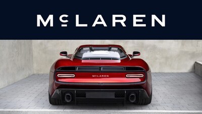
- •The new custom typeface, McLaren Sans, will be the primary brand mark, with the older Speedmark and Speedy Kiwi emblem retained in reduced roles; Papaya will be for racing, and a new "Midnight" navy for road cars.
- •The McL 6GT is the first production car to feature the new branding, with future models spelling out "McLaren" across the rear, and the rebrand aligns with other announcements celebrating Bruce McLaren's legacy and significant company investments.
Key Questions Answered
The new wordmark is inspired by signage that once hung above a family-run service station in Remuera, Auckland, which was owned by the parents of team founder Bruce McLaren, Les and Ruth McLaren.
The McL 6GT, which was unveiled at Monterey Car Week, is the first production car to carry the new branding with the name spelt out across the rear.
Papaya, the color long associated with McLaren's F1 team, will now be used mainly in racing, while road cars will carry a new dark navy shade called Midnight.