
Stories
Why Romance Book Covers Are Now Dominated by Cartoons
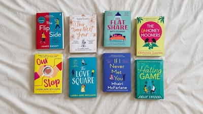
- •The shift to cartoon covers began with Sally Thorne's The Hating Game in 2016, followed by Berkley's embrace of the style for Jasmine Guillory's The Wedding Date and Helen Hoang's The Kiss Quotient.
- •Cartoon covers aim to appeal to core romance readers while also attracting new audiences who might be put off by traditional "clinch" covers or shirtless men.
- •This design choice allows for greater diversity in character representation, moving beyond the limitations of stock photography which often features only white, straight couples.
- •The trend is influenced by the need for covers to look good as small thumbnails on phone screens and is also a more cost-effective option than professional photo shoots.
- •While popular, some long-time romance readers complain that the uniform cartoon style makes it difficult to distinguish between different subgenres or heat levels, and can make adult books appear like YA fiction.
Key Questions Answered
Publishers adopted cartoon covers to make romance books look like light comic fiction, helping readers avoid judgment while reading in public. These designs also appealed to women who disliked traditional clinch covers, and allowed publishers to feature diverse characters when stock photography was limited.
Stock photography historically featured mostly white, straight couples, prompting publishers to use illustrations to depict characters with a wider range of ethnicities, disabilities, sexualities, and body sizes. Blank-faced illustrations also allowed readers to easily project themselves into the love interest role.
Long-time romance readers complain that the uniform illustrated style makes it difficult to distinguish between high-heat and sweet romance novels. Critics also note that these cute designs can make adult books look like young adult fiction or suggest a PG rating.